Time-tracking reports
Reports that fit on one screen, and one slide.
KPI tiles, daily hours, top earners. Export to Excel with formulas or PowerPoint with charts. Built for the once-a-month review and the surprise board meeting.
The numbers that run the team.
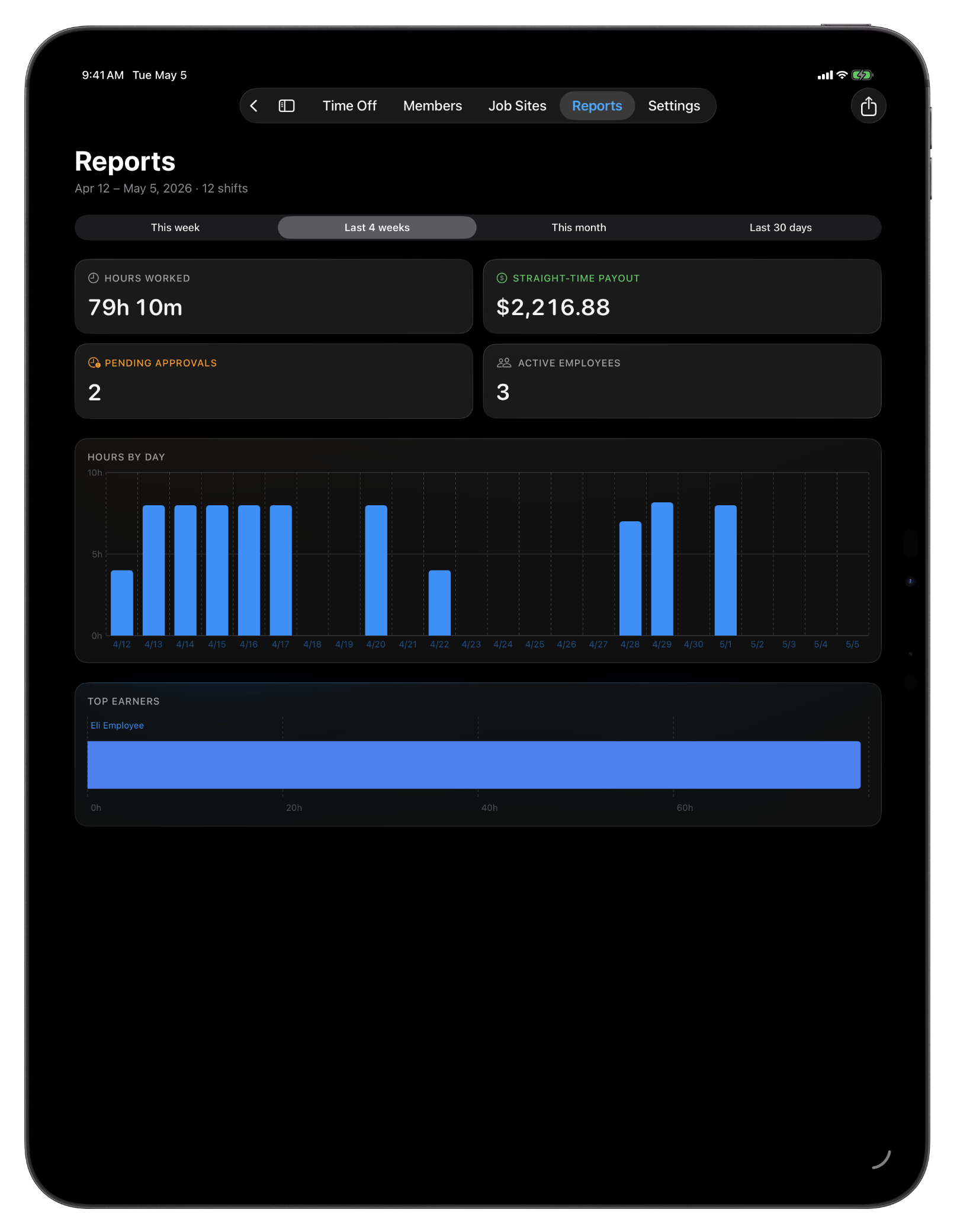
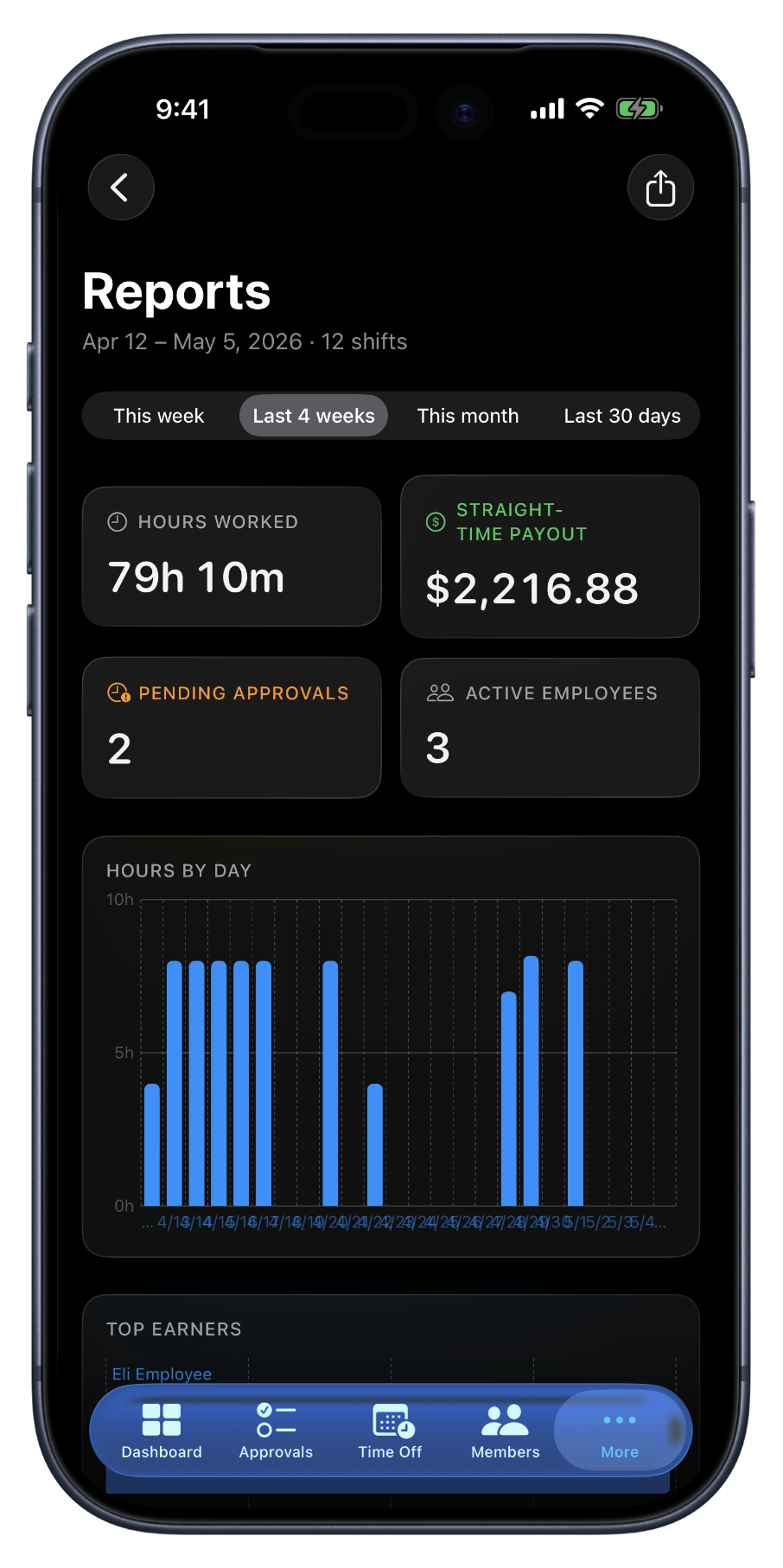
Reports is a single page: four numbers at the top, a chart of hours by day, and the top earners listed below. Total hours, gross paid, shift count, active team, what every owner asks at the end of the month, all in one view. Switch the period from this week to the last month in one click, and every visual rescales.
When you need it on paper, two exports do the work. The Excel download is what you hand your bookkeeper, three sheets, full math, ready to read. The PowerPoint download is what you share with a partner or a board, five slides with charts already drawn, ready to present. Same numbers either way; pick the format that fits the audience.
What the report gives you.
Four numbers up top
Total hours (net of breaks), gross paid, shift count, active team. Each rescales with the period selector.
Hours by day
A bar chart of hours per day across the selected range. Rejected shifts are left out so the chart matches the hours you actually paid.
Top earners
The top 10 employees by hours for the period, with each one's payout next to their hours. Easy to spot who carried the week.
Period selector
This week or pay period, the last four, this month, last 30 days. Period options adapt to whether your org runs weekly or bi-weekly. The same Sunday-anchored boundary your timesheets use.
Excel export
Three sheets, summary, hours by day, per-employee, with formula totals built in. The file your bookkeeper expects to receive.
PowerPoint export
Five slides with the cover, summary, key numbers, and charts already drawn. Open it in PowerPoint or Keynote and present.
When reports earn their place.
Monthly review
Pull the last-30 PowerPoint on Friday afternoon. Share it with your partner or your accountant over the weekend. The numbers are right there on the slides.
End of the month
Switch the period to this month. Top earners tells you who carried the load. The numbers up top inform next month's plan, hiring, scheduling, sites.
Hand-off to your bookkeeper
The Excel file has formula totals built in, so the math doesn't get rebuilt by hand. Drop it in front of payroll and the numbers are ready to read.
FAQ
Questions, answered.
- What date ranges does the report cover?
- Pick from this week, the last 4 weeks, this month, or the last 30 days. Every KPI tile, chart, and export honors whichever period you've selected, so the Excel you download is the exact shape of the screen you were looking at.
- What does the Excel export contain?
- Three sheets: a summary cover with the period's key numbers, an hours-by-day sheet with totals, and a per-employee sheet with their hours and payout. Formula totals throughout, open it in Excel or Numbers and the math is already done.
- What's in the PowerPoint?
- Five slides: cover, summary, key numbers, daily-hours chart, and top earners. The charts are real PowerPoint charts (not images) so the deck stays editable in PowerPoint or Keynote.
- Who can pull reports?
- Owners and managers. Employees see their own hours in the Shifts tab but don't get the org-wide reporting view, that's intentional, since the report rolls up payouts and team-level data.
- Can I schedule reports to email automatically?
- Not yet. For V1, reports are pull-on-demand from the web. Scheduled / emailed reports are on the roadmap; the on-demand exports already cover the once-a-week payroll and once-a-month review cadence most owners run on.
Keep going.
Employee Timesheet Software for Small Teams
Track weekly or bi-weekly timesheets by employee, mark pay periods paid by payment method, apply overtime presets, and export every visible pay period to Excel.
Learn moreEmployee Time Tracking Dashboard for Owners
See pending approvals, who's on shift, hours this week, and team size, all in one view. The owner dashboard built for small field teams.
Learn more
Set up in a minute.
Create an org. Share the join code. Your team punches in today.